Expanding Lyft’s privacy features to centralize how users access and understand their data

Creating a Data & Privacy page with a tabbed interface that centralizes access to data and privacy settings, allowing users to navigate one page while reducing the stress of searching through fragmented information
ROLE
UI/UX Designer
Product Design
DISCIPLINES
Interaction design
UX research
Usability testing
Prototyping
TOOLS
Figma
Illustrator
TIMELINE
3 Weeks
THE PROBLEM
Expanding on Lyft's existing Data transparency structure to lower user cognitive load.
Research indicates users can find information about how their data is used and shared given enough time. However, it also showed how fragmented the current information architecture is.
Original screenflow


Informal interviews to understanding user privacy concerns
Initial interviews helped understand what information users seek from Lyft about their data and protection.
What information is recorded
How user data is used,
Option to opt out of certain information being collected is buried under multiple interactions
Data transparency and reporting
Can the other party identify them after a safety incident?
What details are shared during the report
Protection with calls and messaging
What information the driver will be able to retain and vice versa
Voice recordings during calls
Data while messaging
FINDINGS
Research shows users can find their data information given enough time. However, the current information architecture is fragmented.
HOW MIGHT WE
Design a single, intuitive space where users can explore their data and privacy settings with clarity and confidence?
FINAL SOLUTION
Data & Privacy page centralizing all user privacy concerns
Taking into consideration all iterations and usability testing, a final solution with reduced interaction was prioritized and prototyped.


Tabbed Interface
Which is intuitive to navigate and minimizes user cognitive load, dividing content into 2

Button styled tabbed interface
To maintain ease of navigation but creating a distinct difference between the subpages and the main 2 categories above.

Mutually Exclusive Options
Clear colloquial language to clarify options for sharing data with third party companies, additionally utilizing mutually exclusive options to ensure users can’t chose both outcomes.

Default state: open
Done to pique user interest and show how information is displayed in a simplified way. This is meant to encourage users to explore and open the following 2 banners.
IDEATION
Defining the research direction and methodology
Identifying initial research assumptions and knowledge gaps.
Assumptions
Based on initial understanding of the ride-sharing experience, users’ privacy-related concerns tend to fall into 2 main areas:
What data drivers see
What data Lyft stores
Research Methods
AS-IS, TO-BE Analysis to identify gaps in clarity, structure, and access
Concept modeling to understand relationships between the platform, passengers, and drivers
Emotion-based evaluation to assess user sentiment toward proposed solutions
Early Insights
Privacy and data information is available however distributed across multiple touchpoints
When information is condensed, users may not fully engage with it
Conductive Qualitative research to identify areas for improvement
AS-IS, TO-BE Analysis and Concept Modelling.


Using Benchmarking to Guide Solution Exploration
One of the biggest proponents of data transparency lately and empowering users is Apple, specifically how the app store details which data is linked to users and which are collected.


Creating new wireframes
Developing solution based on existing Lyft design system, creating components and consolidating privacy information from various external web pages to include.


USER DECISIONS
2 Solutions were developed based on UX research
Two different iterations were considered for the final solution, the first focused on a condensed privacy statement while the second organizes the information with icons inspired by the Apple app store interface.


Conducted usability testing through emoticon score method with 50 participants aged 17-65
Used to determine which layout was more engaging and encourage users to read sensitive information. Three different screens are tested, 1 of the main interface to test intuitive navigation, and 2 different layout of data collection information.


OUTCOME
68% Users feel positively using the new "Data & Privacy" page
The final solution improves how users interact with Lyft’s privacy and data information by making it more structured, intuitive, and easier to navigate. By organizing content into clearly defined tabs and simplified decision points, users can quickly understand what data is collected, how it is used, and what control they have over it without feeling overwhelmed.
This reduces cognitive load by breaking complex information into smaller, recognizable sections, allowing users to focus on one type of information at a time. Clear labeling and familiar interaction patterns, such as tabbed navigation and radio buttons with plain language, help users make decisions with greater confidence and less ambiguity.
REFLECTION
Reducing user cognitive mode: simple user input
This project highlights how improving data transparency is less about adding more information and more about how that information is structured and presented. By focusing on centralization, clear hierarchy, and familiar interaction patterns, the solution demonstrates how complex privacy concepts can be made more approachable and easier to navigate.
Through this process, it became clear that users are not necessarily unwilling to engage with privacy information, but are often discouraged by fragmented access and high cognitive effort. Designing with clarity, simplicity, and user control in mind can reduce that friction and support more informed decision-making.
Next
Product design
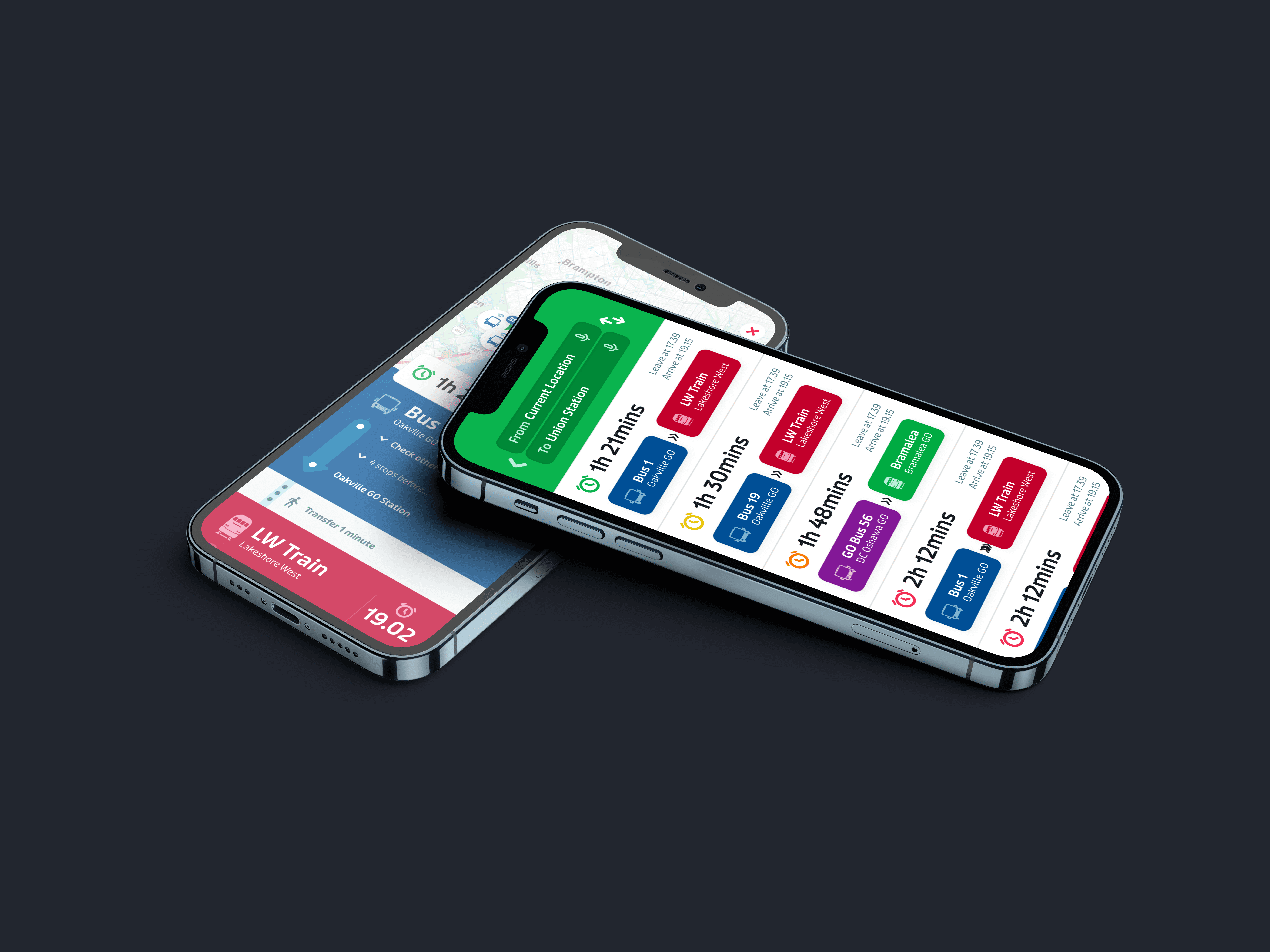
Rethinking Transit Accessibility for Older Adults
Redesigning the Transit app with accessibility features to reduce user cognitive load while maintaining usability for older adults and everyone in between.
" transform="translate(4.353 1.982)" width="39.963302752293565px"/></svg>)